A few years ago, we decided to do our small part to help address the climate emergency. We installed solar panels on our roof as the first step. Then, we ditched gas heating for a more efficient electric solution. Finally, we installed a battery and swapped our fossil fuel burning car for an electric version. I plan to write a future post to share our experience with solar and batteries. In the meantime, here is a previous post about our 4,000km road trip in the electric car.
I digress from the actual topic for this post, which is about a fun project that I embarked on during our seemingly never-ending lockdown. It was fun as the project touched all the areas I am passionate about, data, technology and green energy.
The introduction of new technologies like solar, batteries, or EVs generates a lot of data. Each has an app to track, in real-time, every watt of energy flowing around your house's electric veins. As a user, you are bombarded with a lot of information and a lot of detail. Initially, this might be exciting, but the excitement quickly fades as newer and more captivating phone apps fight for your attention.
At this point, I don't need yet another dashboard of data - even graphical -, it seems like a lot of mental effort to make sense of all the data points. I needed to simplify, to create something that non-data people (that would be the rest of this household) can better understand and appreciate the energy flow in our house.
"Don't Make Me Think!" by Steve Krug is still one of my favourite books that speak to the idea of making the complex simple, without the need to dumb it down.
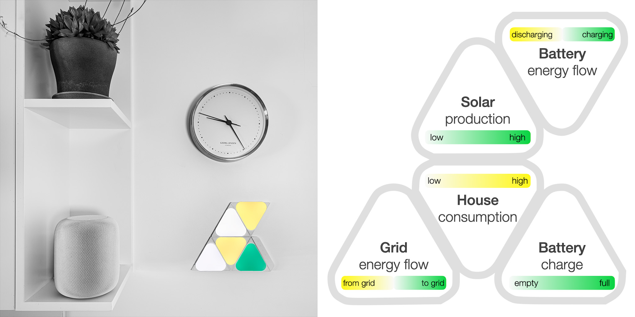
The aim is to show the big picture, a heartbeat of the house, a dynamic visual, a piece of 'art', maybe. Something that can, in an instance, present my subconscious mind with the current mood of the house, an insight into its invisible nervous system. In a split second, the pattern of colour should tell me all I wish to know. A combination of green and white is good, while yellow tones show energy consumption. Updated every 5 seconds.
How is this energy flowing?
How green is our usage?
Are we using the grid?
After a few days of research and some coding, I am happy to say that I think we managed to capture the energy heartbeat of our house. The subtle colour pallet was intentionally chosen to blend in and avoid being the centre of attention. All this is powered by a A$15 Raspberry Pi Zero. If you are interested in the geeky details, see the end of this post.
I might stop here and let a video tell the rest of the story…
... and here is how it works
Geeky bits*
- Roof solar 33 panels, 11.55kW
- Raspberry Pi Zero W
- Nanoleaf light panels
- Nanoleaf light panels API
- Tesla Powerwall 2 battery, 13.5kW
- Tesla Powerwall 2 battery API
- Code to communicate with the energy infrastructure and control of the light panels is written in Rust but could be done in any other language like Python
- Colour pallet choice might not be ideal for colour blind viewers.
.