Eighty Five Seasons: Living Data
Exhibition proposal by Mac Bryla
Why this work, now
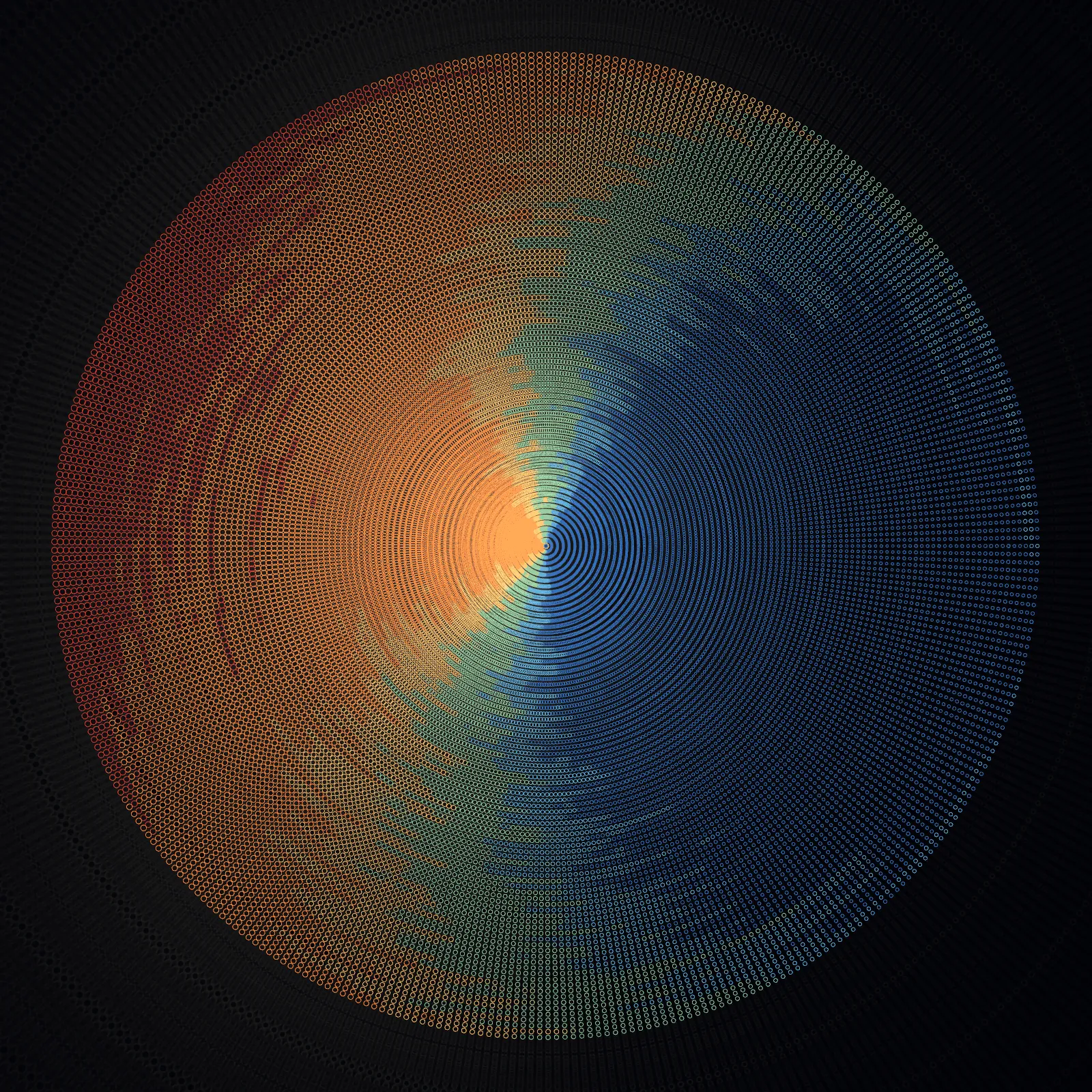
We are surrounded by climate data. Reports, charts, projections, all important, all increasingly ignored. Charts are accurate. They are also easy to scroll past.
This work takes 31,412 days of daily global temperature measurements and renders them as something you want to stay with. The abstract beauty draws you in. The realisation of what's underneath holds you there. Charts explain. Art provokes.
In a world flooded with AI generated imagery, where any image can be produced from a text prompt, this work goes in the opposite direction. Every piece is provably rooted in real data. Every composition could only exist because this specific dataset exists. Nothing is interchangeable. Nothing could belong to anyone else.
AI didn't create this art. But without AI, it wouldn't exist. AI was my collaborator in building the tool, an application I designed specifically for this practice. It didn't make the art. It gave me the means to build my own paintbrushes. I sat down and played the instrument. That distinction matters, and it's a conversation audiences are hungry to have.
The work
The animation above is driven by real temperature data. Every element is positioned by actual measurements. Simulated forces, gravity, wind, act on them, and the composition evolves continuously. It is not random. Every movement traces back to a specific day.
These are not pre recorded videos on a loop. They are live renderings, generated in real time by the application. The composition is never exactly the same twice. It is alive in the truest sense, always responding, always evolving. This is one example from a growing series of animated works.
The same data exists as static compositions. Large format archival prints, each interpreting eighty five years through a different lens. Grids, spirals, particles, fractured cells, painted surfaces. The animation gives the data time. The prints compress it into a single image.
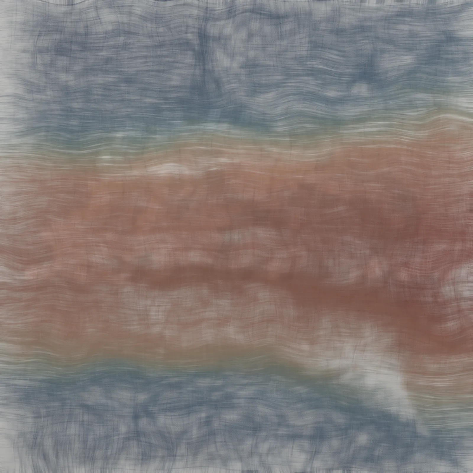
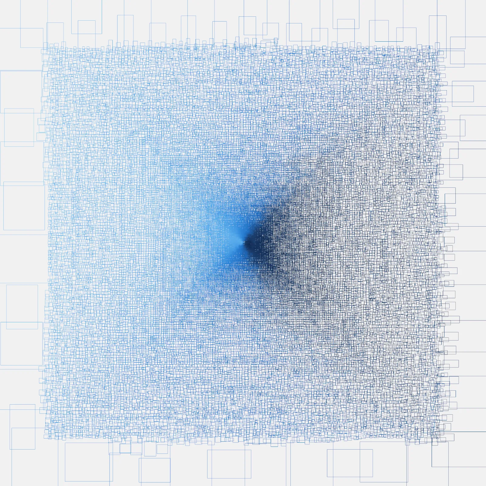
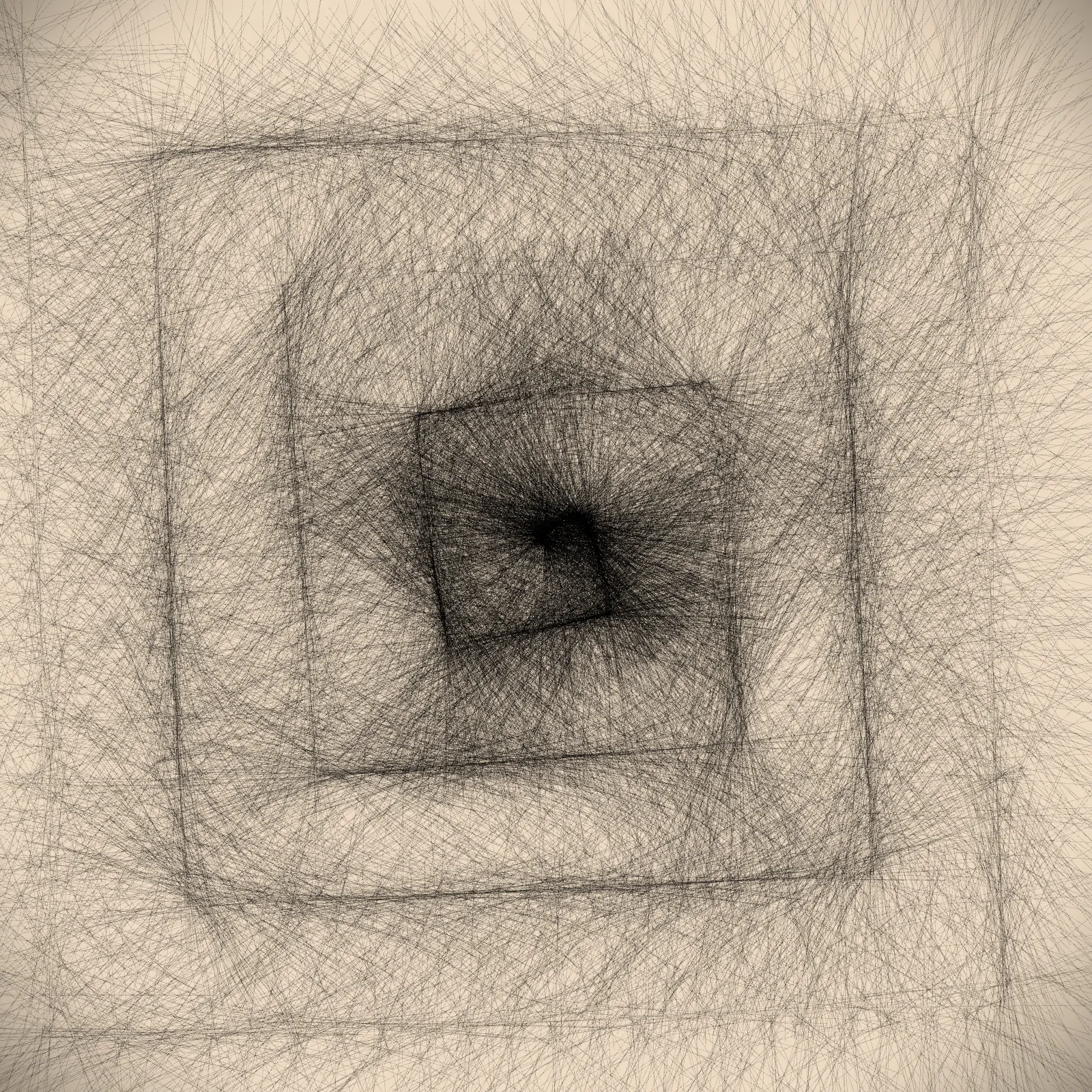
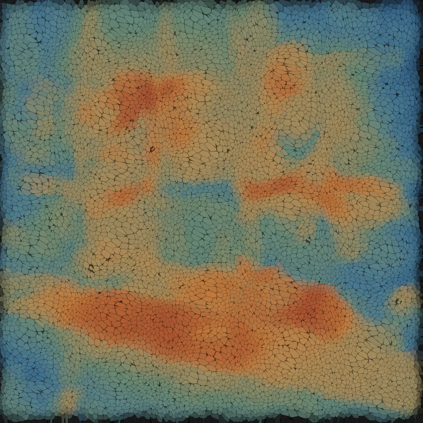
Over 30 compositions across two static series plus animated works. Available as limited edition archival prints at multiple sizes. The full body of work is at macbryla.com/photos/art.
What an exhibition looks like
Animated work on screen alongside large format prints on the walls. The same data, frozen and alive. The number and scale of works fits the available space.
Hybrid works are also available. These are compositions where colour palettes from Antarctic photographs shape the data, so the art carries the emotional temperature of a real place alongside the numbers.
The conversations it starts
This work draws people in who wouldn't normally stop for data or abstract art. The beauty is the entry point. The question, what am I looking at, is the beginning.
Visitors ask: could this be done with my data? The answer is yes. The same tools transform any dataset, a company's emissions, an individual's running history, a city's energy consumption, into a composition that could only belong to them. What would your data look like as art? What story would it tell?
The exhibition doesn't end when people leave. It follows them into their organisations, their networks, their own questions about data and meaning.
More on commissioned work: macbryla.com/commissions
Mac Bryla mac@wiredlizard.com | +61 417 977 566 | macbryla.com